Skip to content
Imagen de botella aguardiente Quezalteca sobre fondo con paisaje de Quetzaltenango. Rediseño de etiqueta por Tridimage.

Mercado del proyecto

  • Guatemala

    Imagen de la Bandera de Guatemala

Quezalteca – Industrias Licoreras de Guatemala

Revamping an Iconic Beverage: Honoring Tradition in the Redesign

1. The Challenge

Revitalize the Image While Retaining Its Distinctive Elements

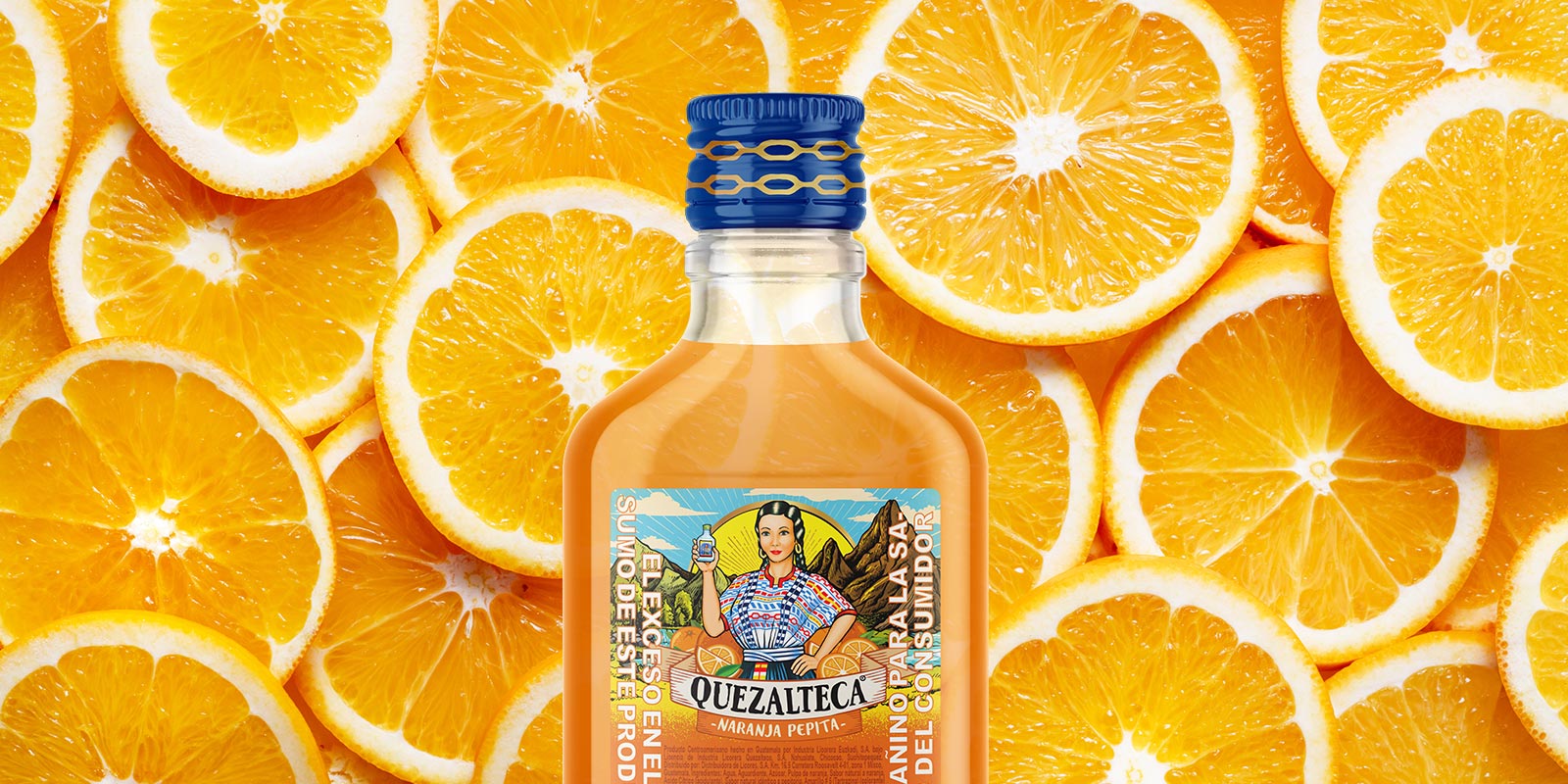
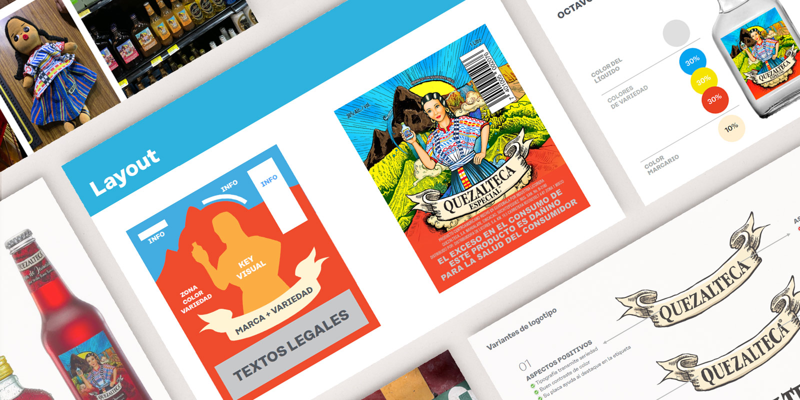
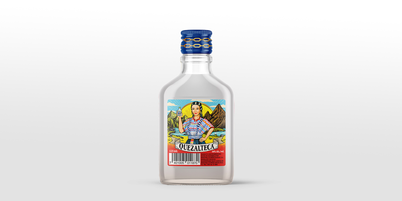
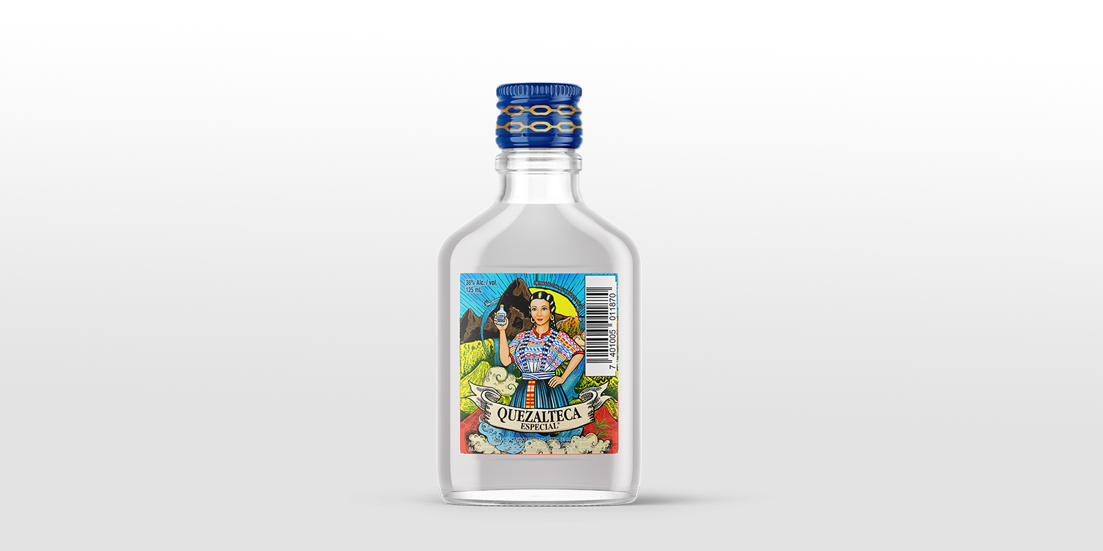
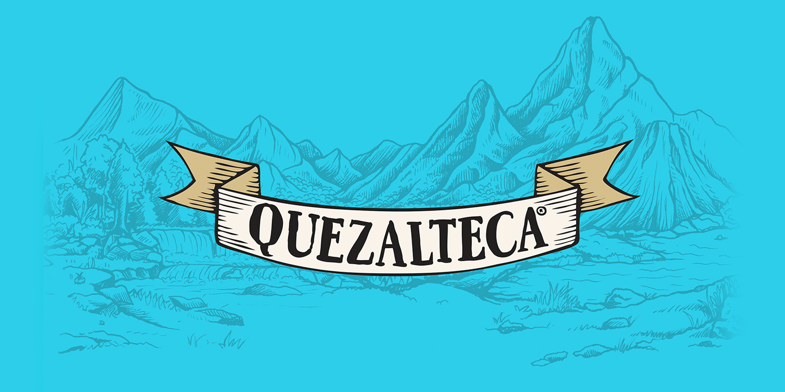
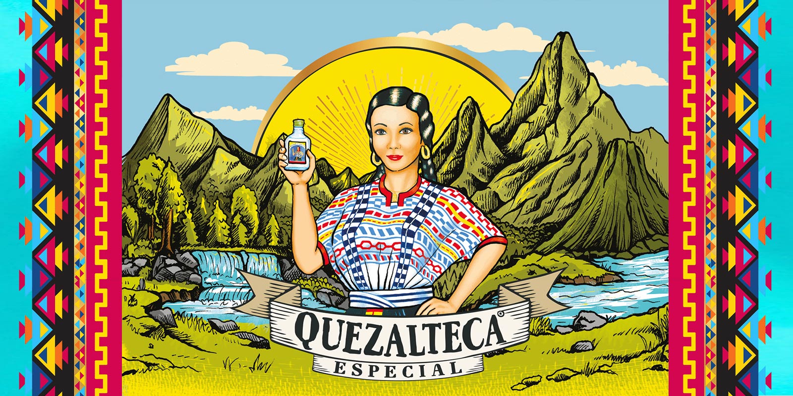
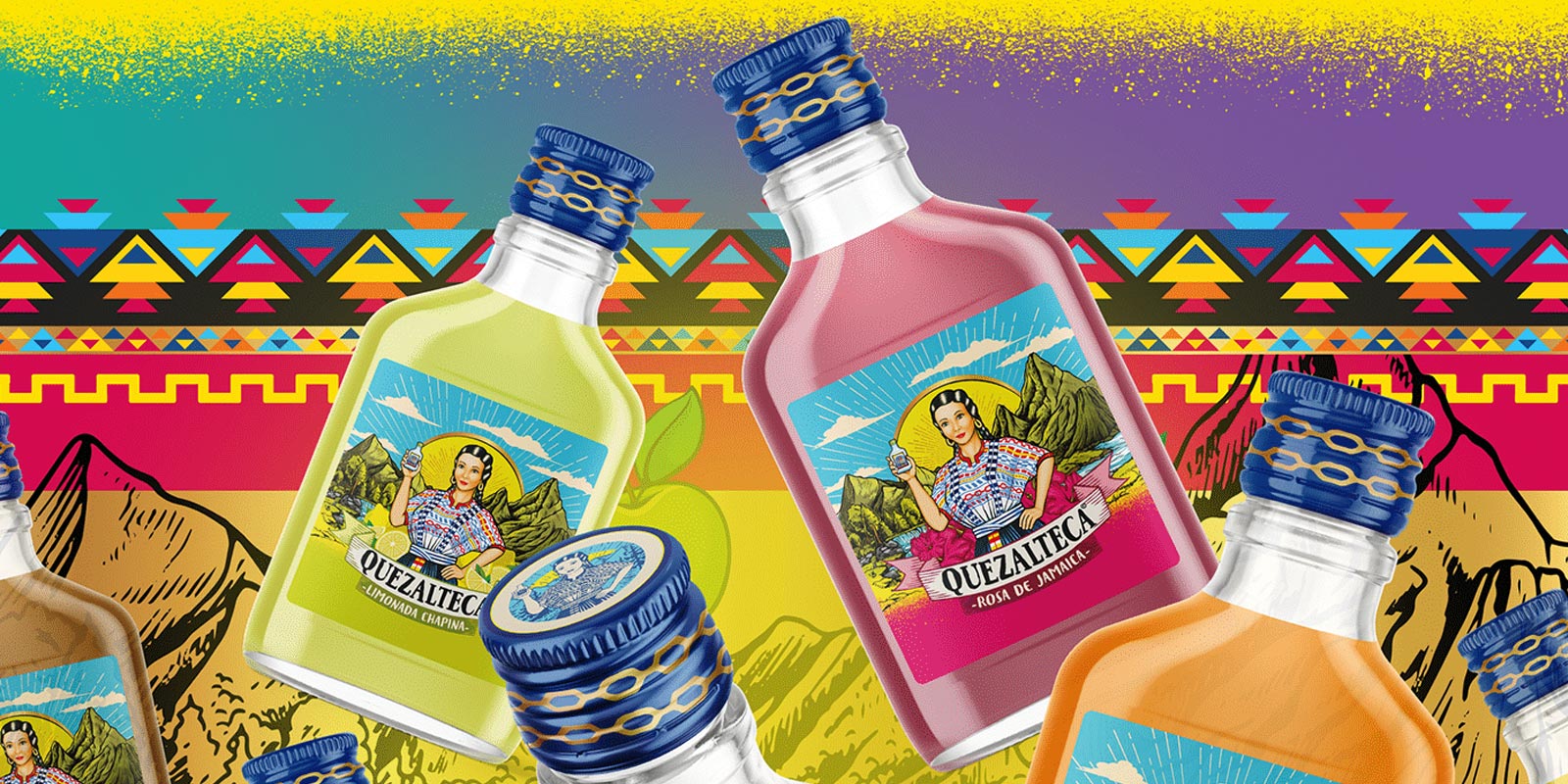
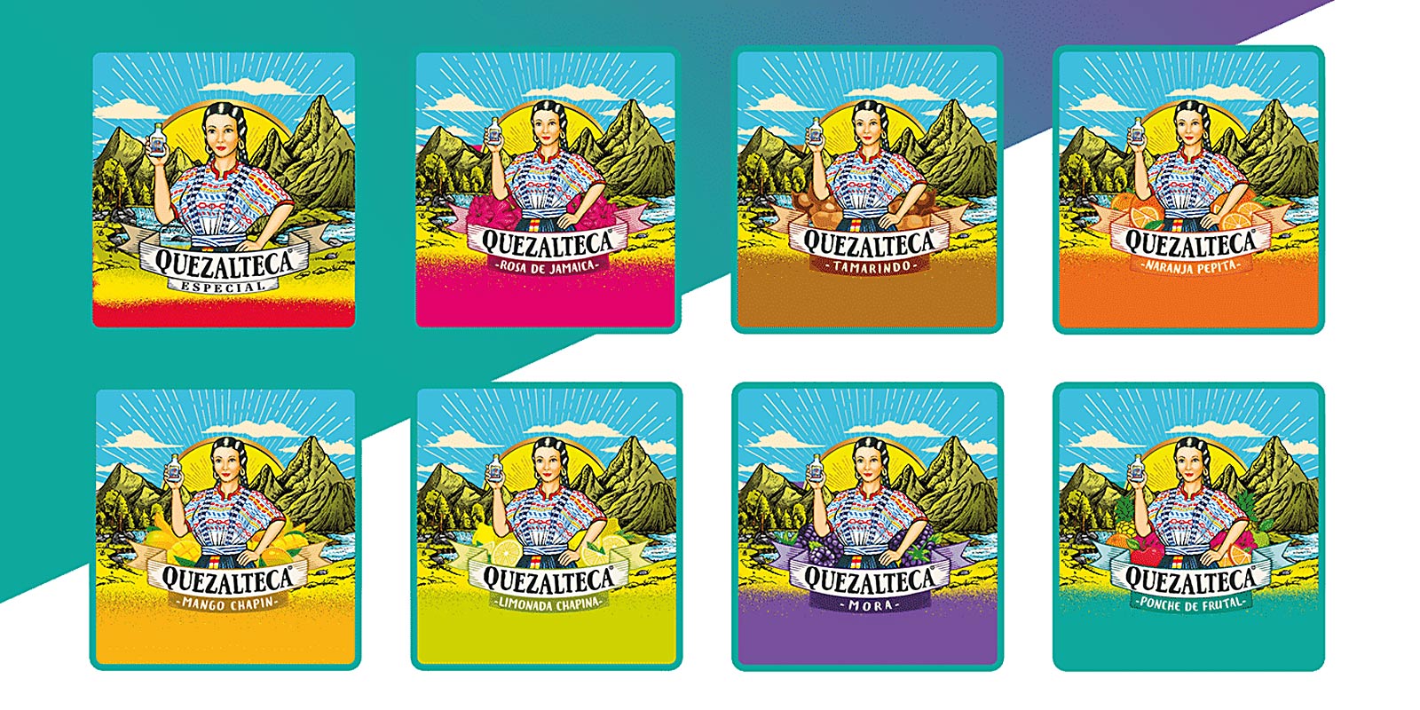
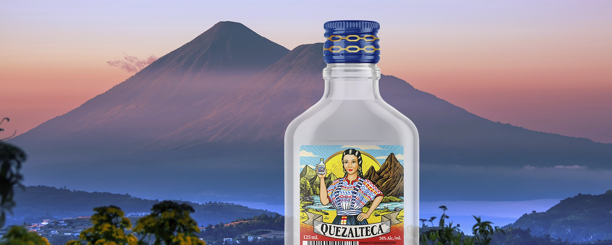
Quetzalteca, the iconic Guatemalan brand of aguardiente, is a true symbol of national pride. Its presence permeates the entire country, from trendy bars to local stores. Its distinctive bottle has even evolved into a sought-after souvenir for visitors to Guatemala. The brand had a solid foundation, yet it required a rejuvenated image to elevate its recognition and target international markets without compromising its cherished distinctive elements. To accomplish this, a segment of the Tridimage team ventured to Quetzaltenango, the birthplace of this beloved beverage. The objective was to deeply engage with its culture and uncover the customs intertwined with this brand. Quezalteca encapsulates the essence and merriment of Chapina culture through the embodiment of Rosita: an affable and vivacious figure as iconic as a saint. Quetzaltenango, on the other hand, is mirrored in the label's colors, blossoms, and majestic mountains.

Tridimage's packaging audit sets them apart, as it encompasses a comprehensive evaluation of technical elements followed by insightful improvement suggestions. They not only excel in creative packaging design, but also approach it holistically, taking into account the functional, industrial, and creative aspects of packaging. This multi-faceted approach ensures a well-rounded and effective outcome.
Mario León Alonzo

Mario León Alonzo Innovation Manager at Industrias Licoreras de Guatemala

First Image Gallery

Imagen de botella de aguardiente Quezalteca sabor naranja pepita en fondo de rodajas de naranja, rediseño de etiqueta por Tridimage.
Diagnóstico de marca y portfolio Quezalteca por Tridimage.
Workshop de auditoría de marca junto al equipo de Quezalteca, dirigido por Tridimage.
Ilustración de paisaje, símbolo de la marca Quezalteca, rediseño por Tridimage.

2. The Solution

Streamline the Key Iconography by Eliminating Distractions

With the goal of honoring the core essence of Quezalteca, our proposal was to refine both its logo and labels. ur aim was to visually enhance the brand identity and products, ensuring a more potent impact and recognition. We streamlined information and elevated the use of color to make a striking impression amidst the crowded shelves of global and rival brands. By eliminating unnecessary elements from the labels, we clarified the information hierarchy and standardized the brand across all products. Colors were strategically employed to accentuate flavors and distinguish between varieties. We even introduced playful variations in Rosita's expressions for an added touch of whimsy. Concurrently, we established a sub-brand for the "Ready To Drink" (RTD) cocktail, an innovative product requiring clear differentiation from the traditional line of flavored drinks. Every design element aimed to convey the brand's ethos: a sense of freshness, flavor, and the joy of shared moments with friends.

Segunda Gallería del Imágenes

Quezalteca – Industrias Licoreras de Guatemala
After
Quezalteca – Industrias Licoreras de Guatemala
Before
Logo de Quezalteca, rediseño por Tridimage.
Ilustración de mujer con traje típico de Guatemala sobre fondo de montañas, símbolos de la marca Quezalteca, rediseño por Tridimage.
Composición de varias botellas de aguardiente Quezalteca flotando sobre un patrón tradicional de Guatemala, rediseño de packaging por Tridimage.
Mosaico de etiquetas para aguardiente saborizada Quezalteca, rediseño por Tridimage.
Foto de botella y lata de bebida Quezalteca Chispuda lista para tomar.

3. The Results

A Brand Retaining its Essence with Expanded Opportunities

We successfully rejuvenated Quezalteca's packaging design, preserving its authentic Guatemalan essence. This effort instills pride and a deep sense of connection among its dedicated consumer base. The revamped illustration honors the brand's heritage and symbolism while bolstering its position as the premier aguardiente in the country. Through our efforts, we established robust guidelines to fortify the brand's visual identity, thereby paving the way for its seamless entry into international markets. Along this journey, we crafted a vibrant and appealing image tailored for the younger demographic, encouraging them to capture moments with the product and share them.

Tridimage delivered an exceptionally professional process characterized by well-defined stages that added substantial value to our project. They skillfully struck a balance between the functional aspects of design, including brand architecture and shelf visibility, and the creative elements, culminating in a design that surpassed our expectations. Their adjustments to our brand image, even though it had a strong tradition, were warmly embraced and yielded impressive results. We observed a substantial boost in our brand's sales, extending not only to our core products like spirits but also to our sub-categories, such as RTDs.
Mario León Alonzo

Mario León Alonzo Innovation Manager at Industrias Licoreras de Guatemala

Comparte en: