Skip to content
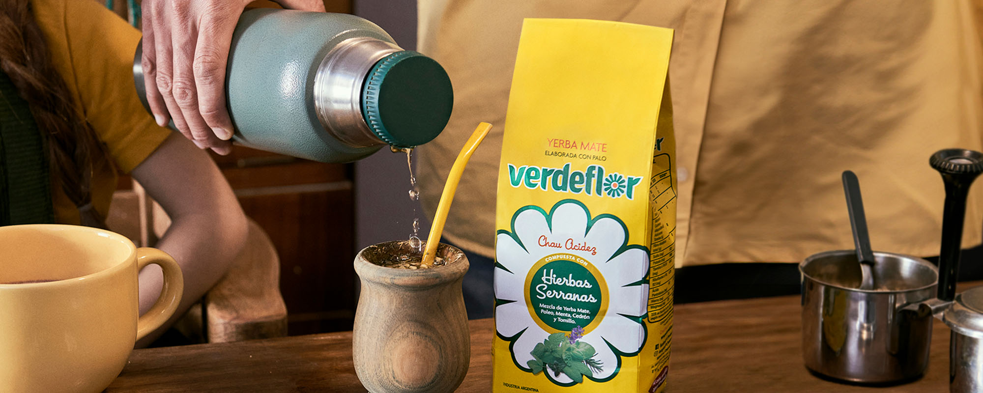
Paquete de yerba saborizada color amarillo marca Verdeflor, sobre una mesa de madera, junto a una persona cebando un mate, rediseño por Tridimage.

Refreshing a Traditional Image to Bloom in New Markets

Mercado del proyecto

  • Argentina

    Imagen de la Bandera de Argentina

Verdeflor – Cordeiro Group

1. The Challenge

Revamping a Traditional Brand Without Losing Its Essence

Yerba Mate Verdeflor, a brand from the Argentine company Grupo Cordeiro, needed a concept that would present all its variants and convey its essence. Leaders in blended and flavored yerba mates in the Cuyo and Northwest regions, they were already growing in other parts of the country.

With the new design, the company sought an updated image to launch into new markets. At the same time, they wanted to show their loyal audience that they hadn't lost the traditional identity they so valued.

After an in-depth briefing process on Verdeflor's positioning and expectations, we immersed ourselves in the brand, identifying its distinctive assets to respect and evolve them.

Understanding that we wanted a product with national and international projection, we considered that we had to work with the best. In that search, we found Tridimage. They are a partner we work with on equal terms, in a relationship of mutual respect and understanding. It was a pleasant surprise to find an agency that approaches projects with a strategic method.
Ernesto Cordeiro

Ernesto Cordeiro General Manager at Grupo Cordeiro

First Image Gallery

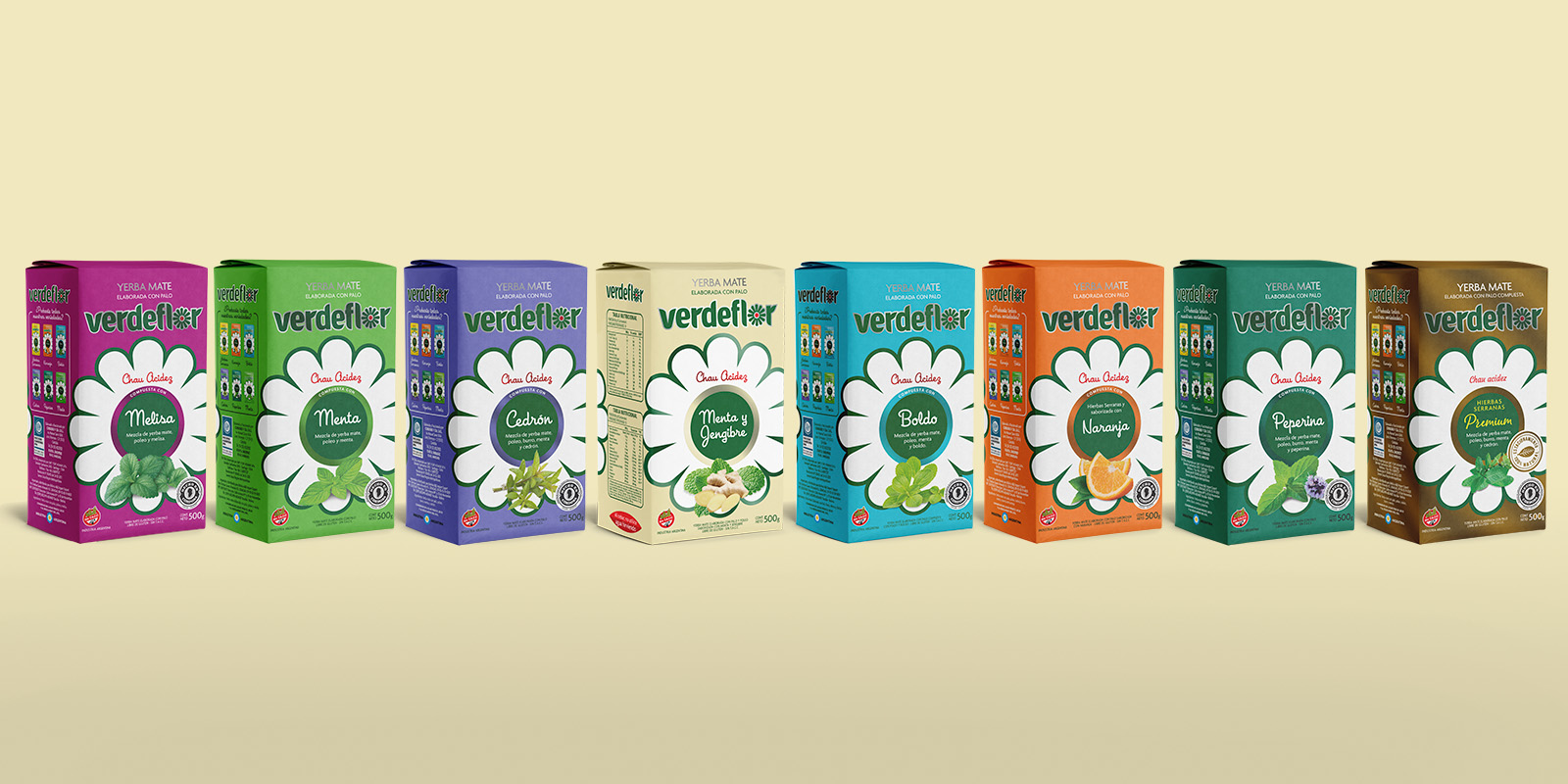
Línea completa de paquetes de yerba mate Verdeflor, mostrando una variedad de sabores y colores distintivos de la marca, rediseño por Tridimage.
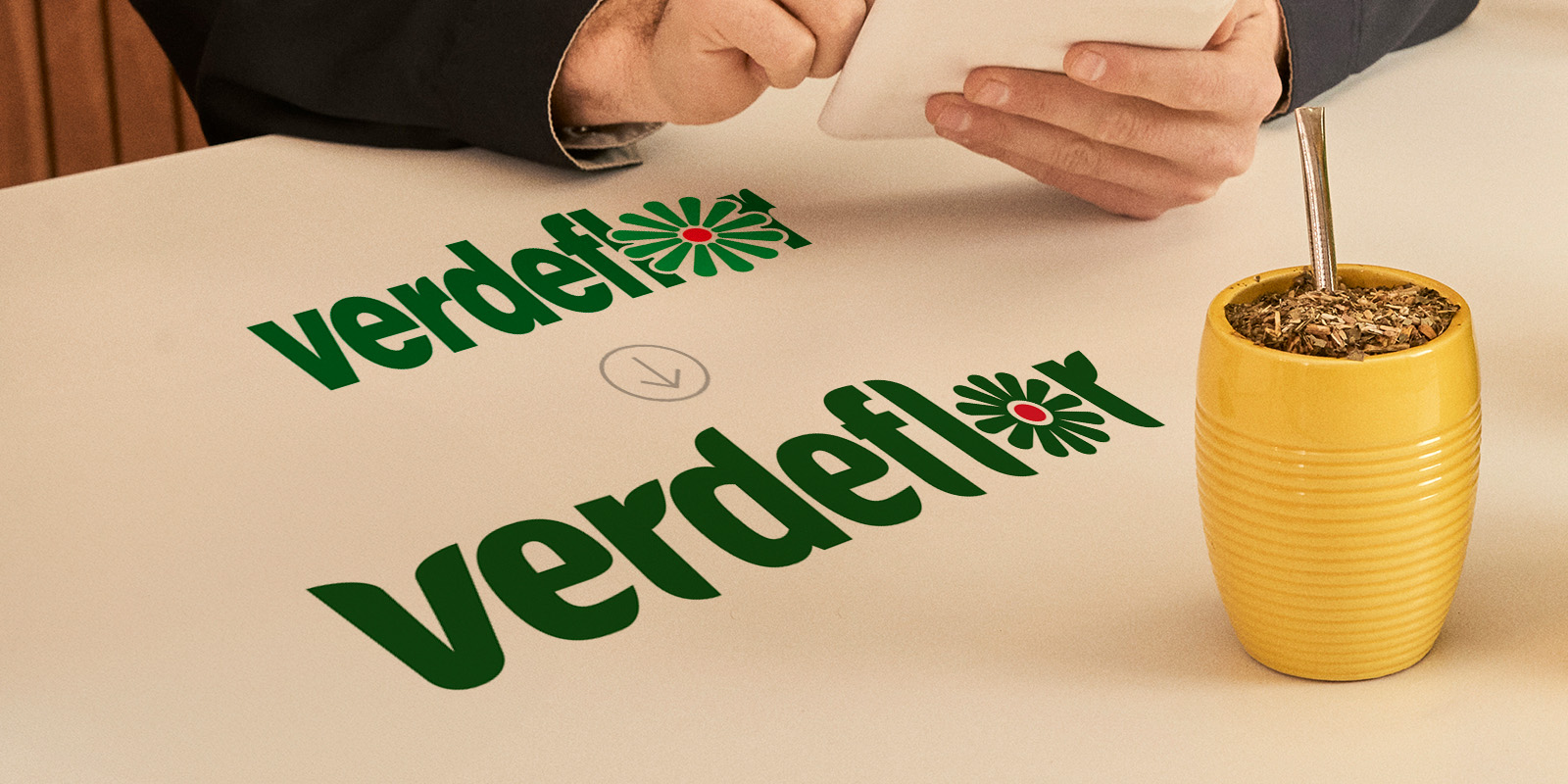
Comparación del rediseño del logo Verdeflor, mostrando el original y la versión actualizada con un estilo más moderno y estilizado.
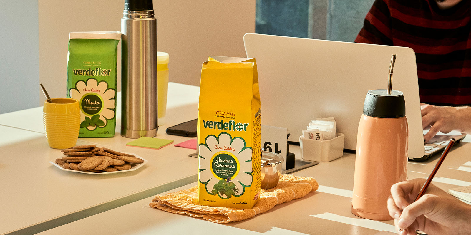
Escena de trabajo con yerba mate Verdeflor, donde una persona dibuja y otra utiliza una laptop, con mate y termo sobre la mesa.

2. The Solution

Evolving Brand Assets

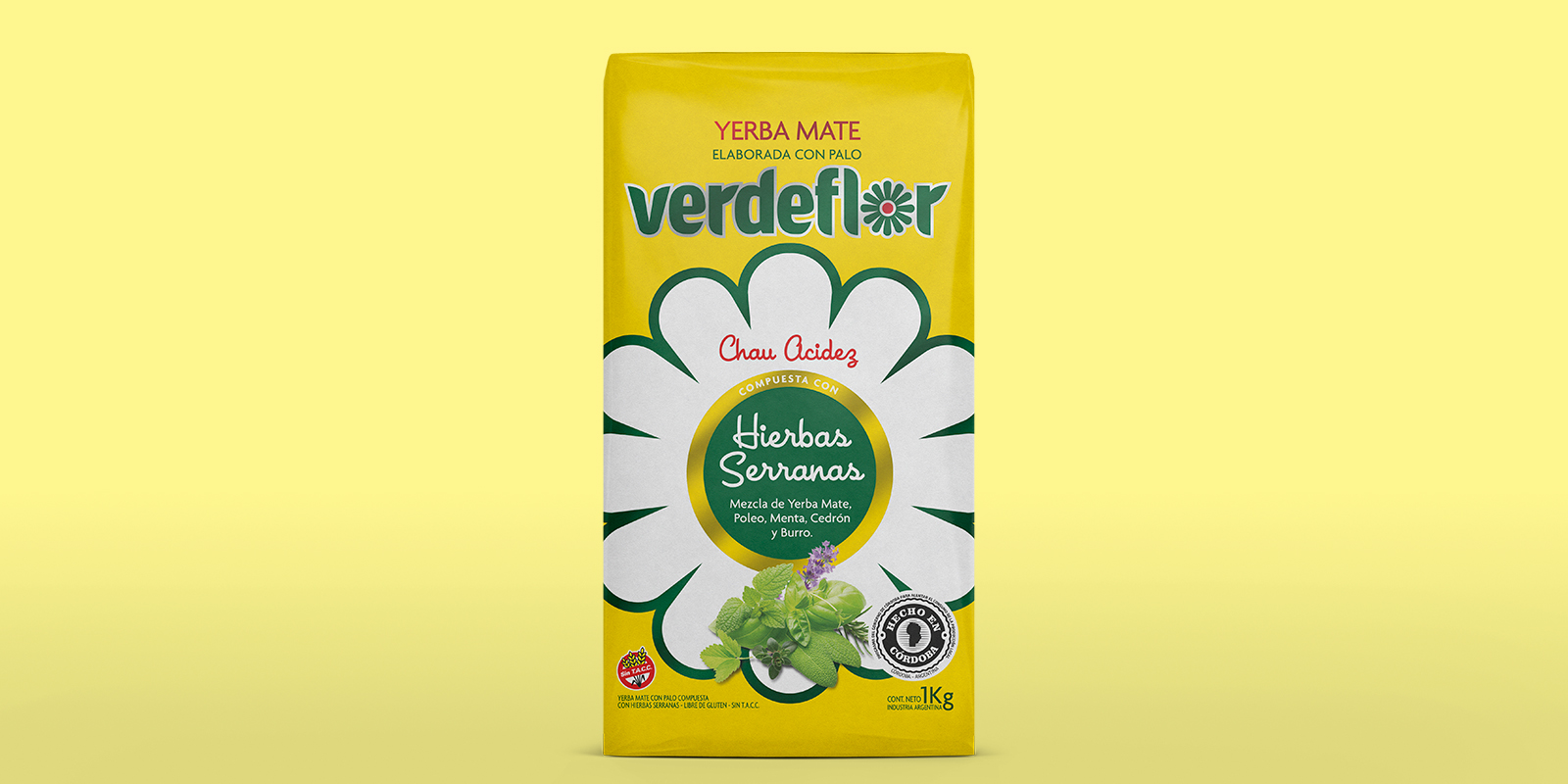
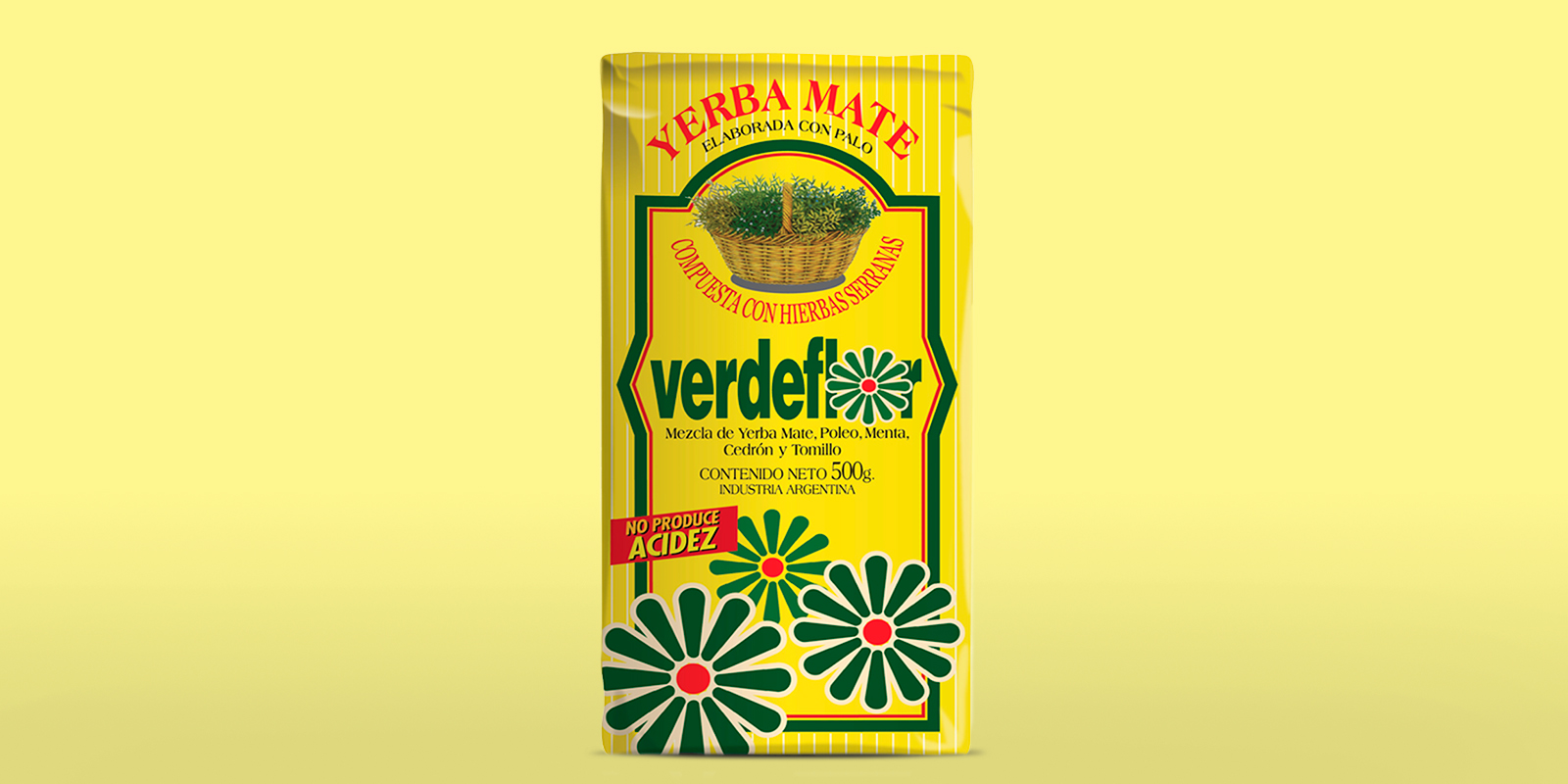
Verdeflor's image evolution began by respectfully updating the logo, carefully preserving its distinctive assets: the color and flower symbol. On the packaging, we simplified and reorganized the visual hierarchy and key claims, clearly presenting the renewed brand.

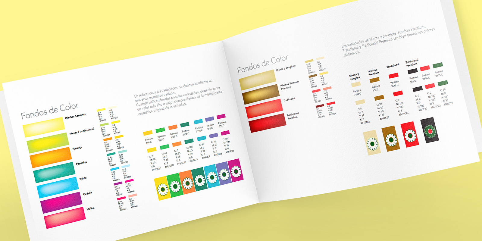
We gave prominence to the variety description, as the line's main differentiator is being flavored. We also created a contemporary and attractive color palette to highlight the full portfolio.

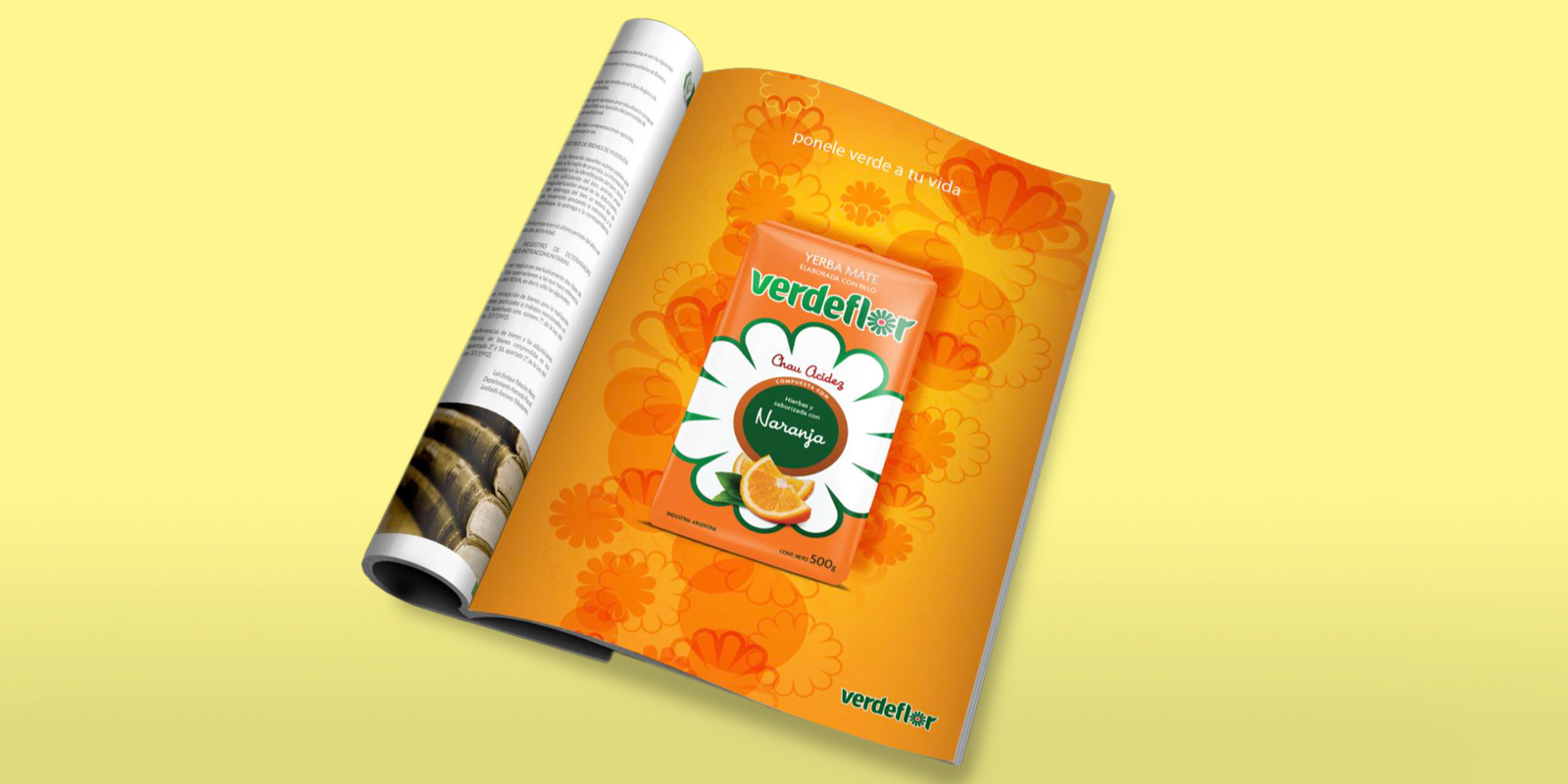
Finally, we designed a look & feel that would allow for consistently developing graphic solutions for the brand, both online and in point-of-sale materials.

Segunda Gallería del Imágenes

Verdeflor – Cordeiro Group
After
Verdeflor – Cordeiro Group
Before
Manual de marca Verdeflor, mostrando paleta de colores y códigos, diseño por Tridimage.
mockup de anuncio publicitario de yerba mate Verdeflor sabor naranja y mosaico de publicaciones de Verdeflor para Instagram

3. The Results

Conquering Shelves with Disruptive Packaging

The new packaging significantly improved the product's shelf presence; consumers positively noticed the difference compared to other competing brands.

Grupo Cordeiro's commercial and repositioning goals were achieved, not only conquering new buyers but also regaining those who had drifted away. Today, Verdeflor ranks among the top five leading flavored yerba mate brands in Argentina.

The work experience far exceeded our expectations. From the first sketches, we knew the design would set a trend and be disruptive packaging for the category. It positioned us as a brand to watch, leaving behind the image of 'just another brand.' Tridimage is at the forefront of food packaging design in Argentina. Four years after the redesign, we've grown 60% in sales thanks to the new image, among other significant factors.
Ernesto Cordeiro

Ernesto Cordeiro General Manager at Grupo Cordeiro