Skip to content
rina pastas matarazzo diseño packaging

Mercado del proyecto

  • Argentina

    Imagen de la Bandera de Argentina

Rina Matarazzo – Molinos

Repositioning a Leading Pasta Brand with a Premium Sub-Line

1. The Challenge

A Once-Acclaimed Brand Losing Its Foothold in Homes

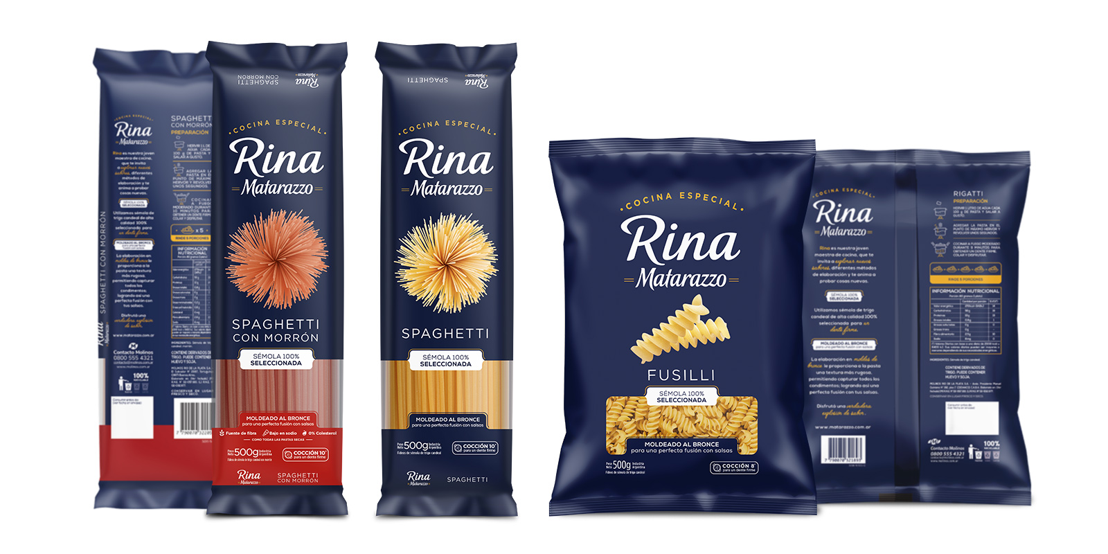
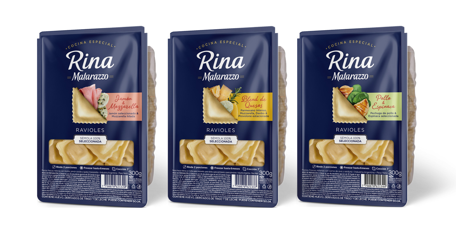
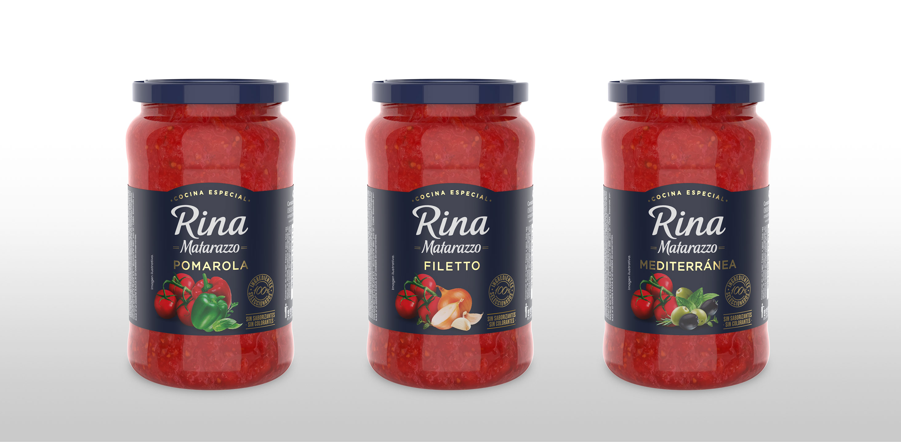
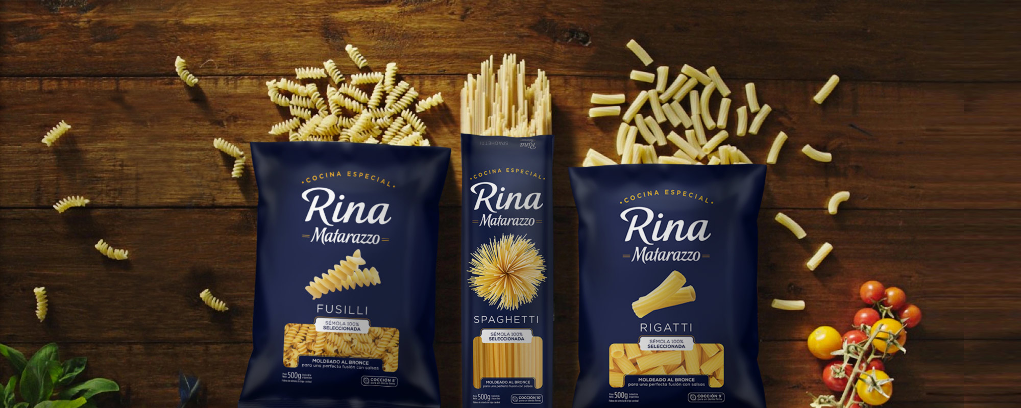
Matarazzo is a renowned Argentine brand specializing in the pasta category, boasting over 80 years of leadership and the most extensive product range. Given the significant downtrading trend witnessed in the segment in recent years, brand managers recognized an opportunity to elevate its status through the introduction of a premium product sub-line. Impressed by our track record in repositioning major brands, the team placed their trust in Tridimage to develop the identity, branding, and packaging for this new line.

While it was a sub-brand, we recognized the significance of thoughtful naming. Tridimage´s assistance was invaluable. We explored various approaches, all of which met the criteria outlined, and ultimately settled on a name and personality that authentically embodied the brand. Additionally, they emphasized the importance of conveying a genuine narrative to establish a connection with the consumer base—a story that is valued and stirs a genuine desire for the product. Their guidance in this aspect was immensely valuable.
Veronica Zawadzki

Veronica Zawadzki Head of Communication at Molinos Río de la Plata

First Image Gallery

Rina Matarazzo diseño de packaging para pasta seca
Rina Matarazzo auditoría de diseño de packaging

2. The Solution

We Challenged the Established Norms to Target a Different Segment

Following a comprehensive assessment of the Matarazzo brand and its product range, we determined that crafting a sub-brand with a distinctive identity and visual cues, reflective of its longstanding history and premium attributes, was the way forward. The primary distinguishing factor for this product lies in the utilization of bronze molds, resulting in pasta of exceptional quality. To underscore this uniqueness, we introduced seals on the packaging. Additionally, we strategically organized the information for swift recognition on the shelf and easy comprehension. Notably, even the parent brand embraced alterations to ensure it didn't vie with the new logo.

Segunda Gallería del Imágenes

Rina Matarazzo diseño de packaging pastas frescas
Rina Matarazzo storytelling por Tridimage
Tres frascos de salsas Rina Matarazzo, diseño de etiquetas por Tridimage

3. The Results

Introducing Rina, a New Brand Infused with a Gourmet Essence

Our endeavor culminated in the birth of Rina, a brand boasting an internationally resonant visual identity, engineered to reestablish Matarazzo as an authority in its category. This new product line, while more refined in scale compared to the broader family, sets its sights on a demographic with heightened purchasing capacity.

Tridimage´s support was invaluable in translating our concept into reality, from sourcing the ideal photo to overseeing production, ensuring that materials and colors aligned seamlessly with our vision. Their commitment to the implementation phase was pivotal. They possessed a keen understanding of how to effectively bring our creative idea to life, which was of utmost importance. The Rina project, in terms of quality, delivered an exceptional outcome. We successfully established a new premium sub-line that remained true to our essence while adding significant value.
Veronica Zawadzki

Veronica Zawadzki Head of Communication at Molinos Río de la Plata

Comparte en: