Skip to content
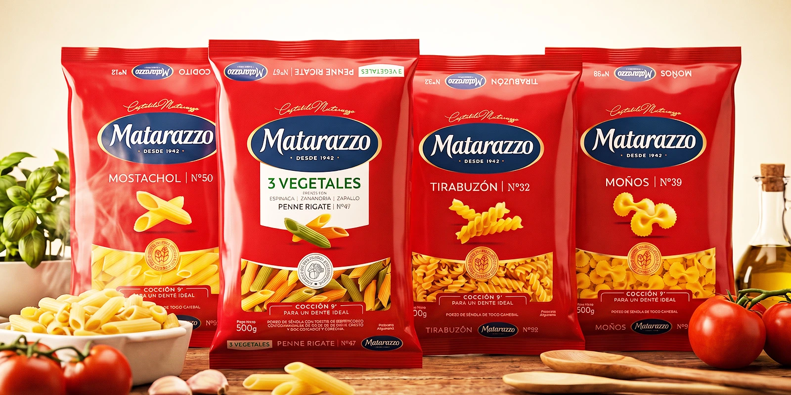
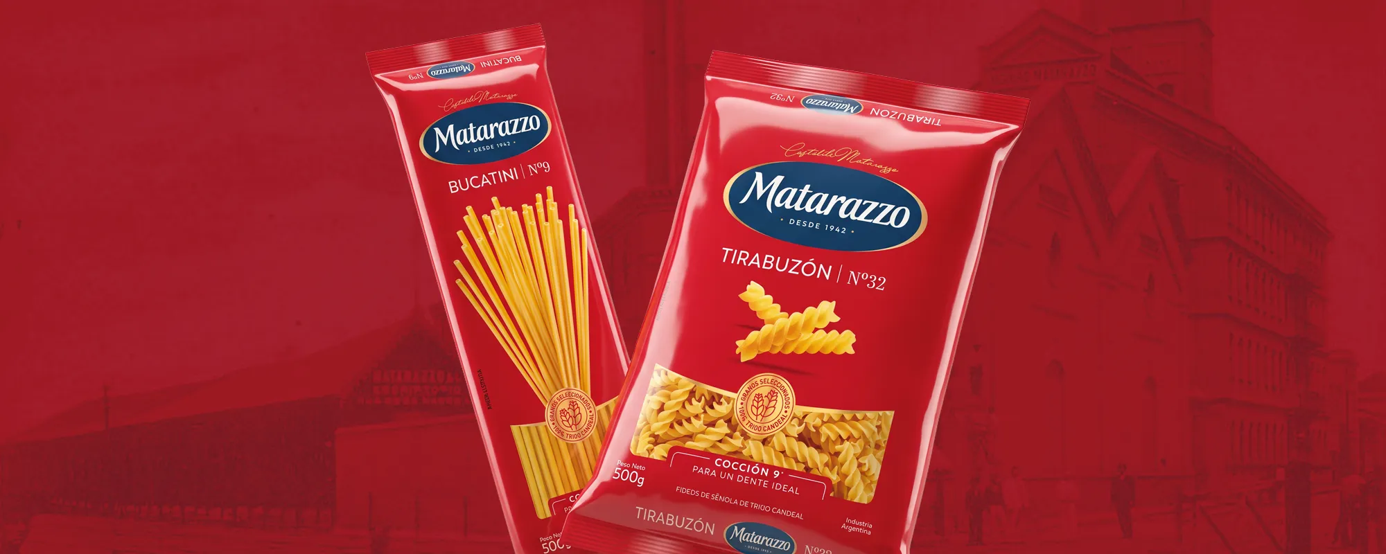
Paquetes de fideos Matarazzo sobre fondo rojo con arquitectura histórica argentina.

Making the Expertise of a Historic Pasta Brand Visible

Mercado del proyecto

  • Argentina

    Imagen de la Bandera de Argentina

Matarazzo – Molinos Río de la Plata

1. The Challenge

Recovering Heritage Credentials in Packaging

Matarazzo has been making pasta in Argentina since 1942 and was the first brand in the country to offer 100% durum wheat noodles. Today it leads brand recall in its category, but its packaging no longer reflected that capital of quality and expertise.

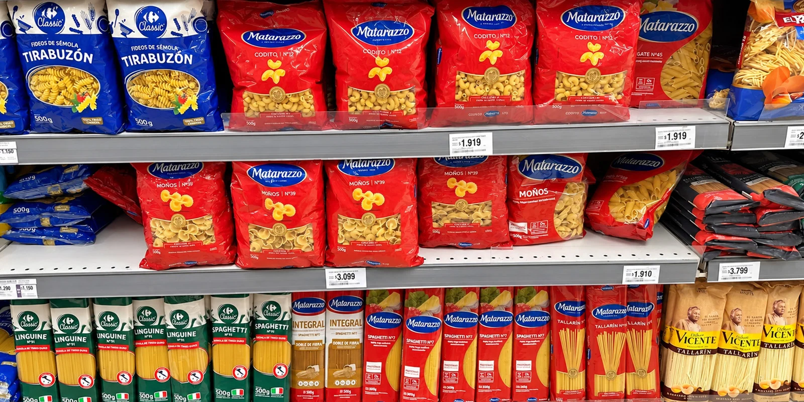
On the shelf, the characteristic red still generated a strong brand blocking, recognizable from a distance. The problem appeared when looking at each pack up close. The core line hadn't reviewed its image since 2017. In that time, each variety had resolved its front panel separately, and too many layout models coexisted. In addition, the parent brand had no calibrated proportions, and the areas of the front panel competed with each other.

Added to that was a messaging problem. The claim "100% durum wheat," which had been foundational, now appears on the packaging of almost all the competition. In a mass-market consumer category where shoppers switch brands without much hesitation, Matarazzo needed to show itself once again as the pasta expert it has always been.

We had the challenge of continuing to build on quality. The brand never weakened and is still number one in many attributes, associated with superior product quality, but the pack didn't match that perception. After many studies on what to tell the consumer and what stood out to them, we detected insights that led us to rework the brand. We wanted much cleaner packaging, with the benefits that consumers value today, and that also helps them achieve that ideal "al dente."

Martina Colombo Mei

Martina Colombo Mei Pasta Brand Manager at Molinos Río de la Plata

First Image Gallery

Variedad de paquetes de fideos rojos Matarazzo dispuestos sobre una mesa con vegetales frescos.
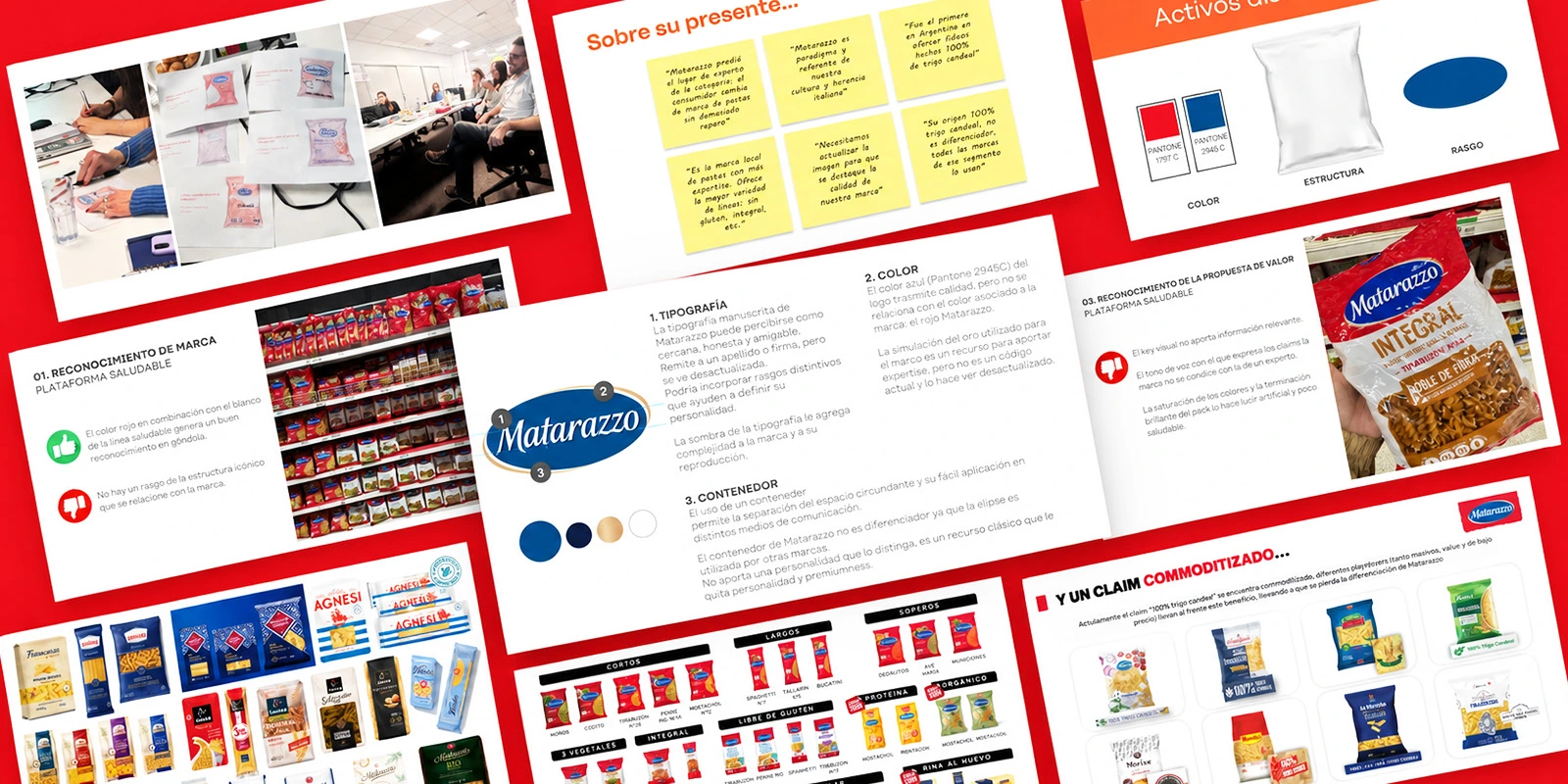
Presentación de estrategia de branding, diagnóstico y auditoría de packaging para Matarazzo.
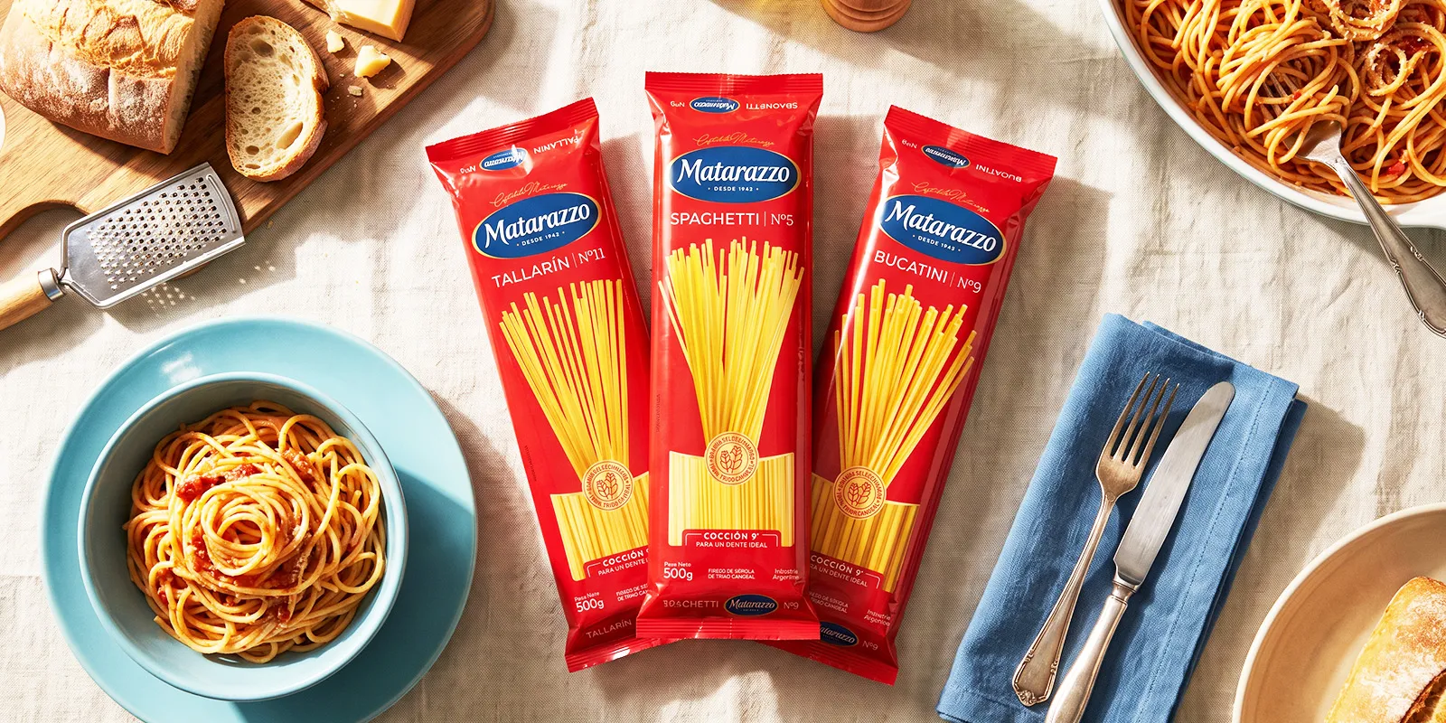
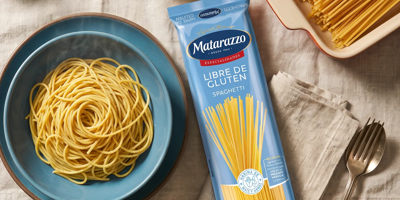
Nueva línea de fideos largos Matarazzo exhibida en una mesa con ingredientes y platos preparados.

2. The Solution

Incorporating an Expert's Codes Into the Design

We audited and worked on 37 SKUs of dry pasta, from the core line to the specialty varieties. Before defining the aesthetics, we asked ourselves a question that organized the entire process: what does an expert look like, and what codes would they use?

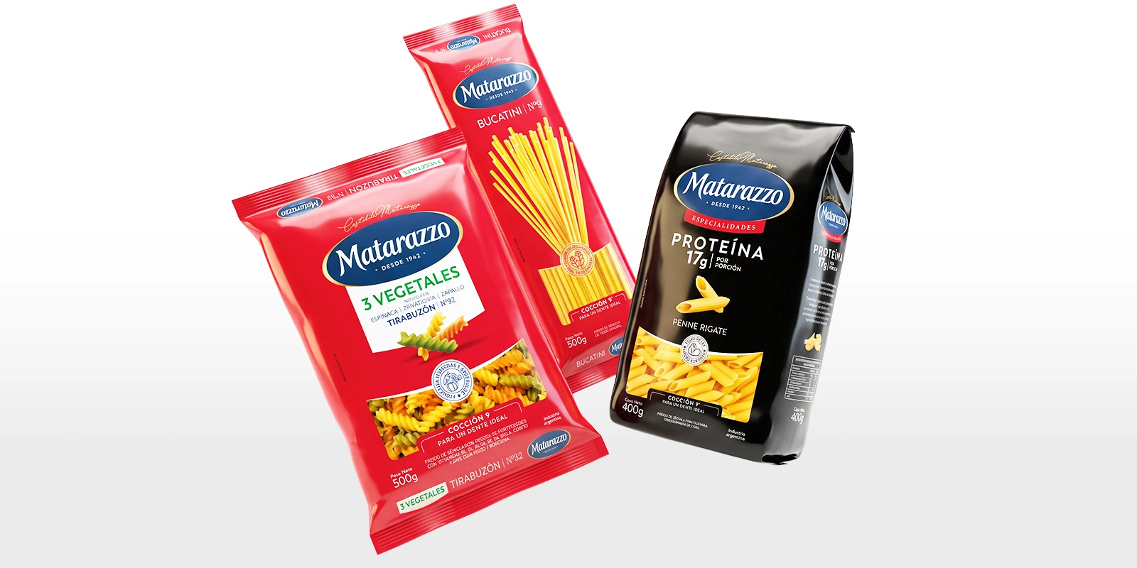
The answer led us to preserve what consumers already recognize and make it more sophisticated. The oval, one of the brand's strongest distinctive assets, was kept with new proportions, and a more elegant blue was chosen. The red evolved into a more sober shade that adds perceived value without giving up brand blocking on the shelf.

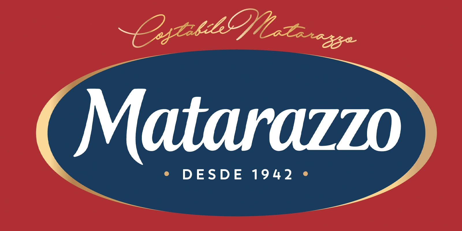
To reinforce the origin, we recovered Costábile Matarazzo's signature as a mark of authorship and mastery, and added the year 1942 to the logo. It is the direct connection to the founder, who came from Italy to Argentina with the knowledge of pasta; a nod to the beginning of the story.

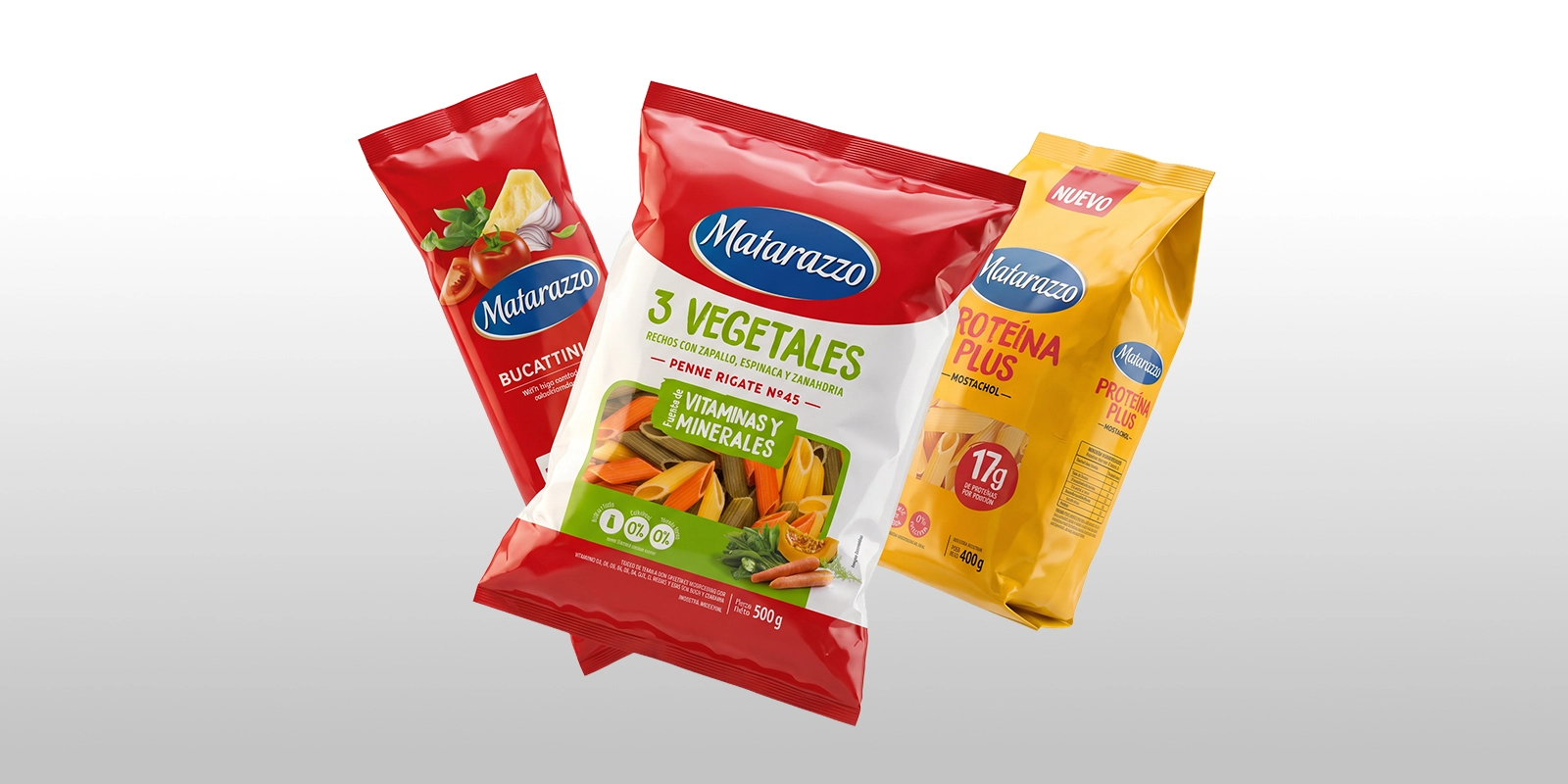
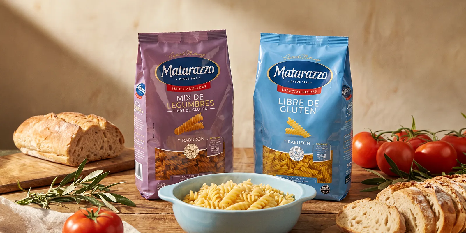
To make choosing on the shelf easier, a seal unifies the promise of quality raw materials in the core line and the functional benefit in the specialties. These are also distinguished by color, and each format now indicates a specific cooking time so the pasta reaches the ideal al dente.

Finally, we unified the layout of all the lines. This way, each front panel reads faster and the portfolio gains consistency at the point of sale. An evolutionary packaging redesign that reaffirms the brand's expertise.

Segunda Gallería del Imágenes

Matarazzo – Molinos Río de la Plata
After
Matarazzo – Molinos Río de la Plata
Before
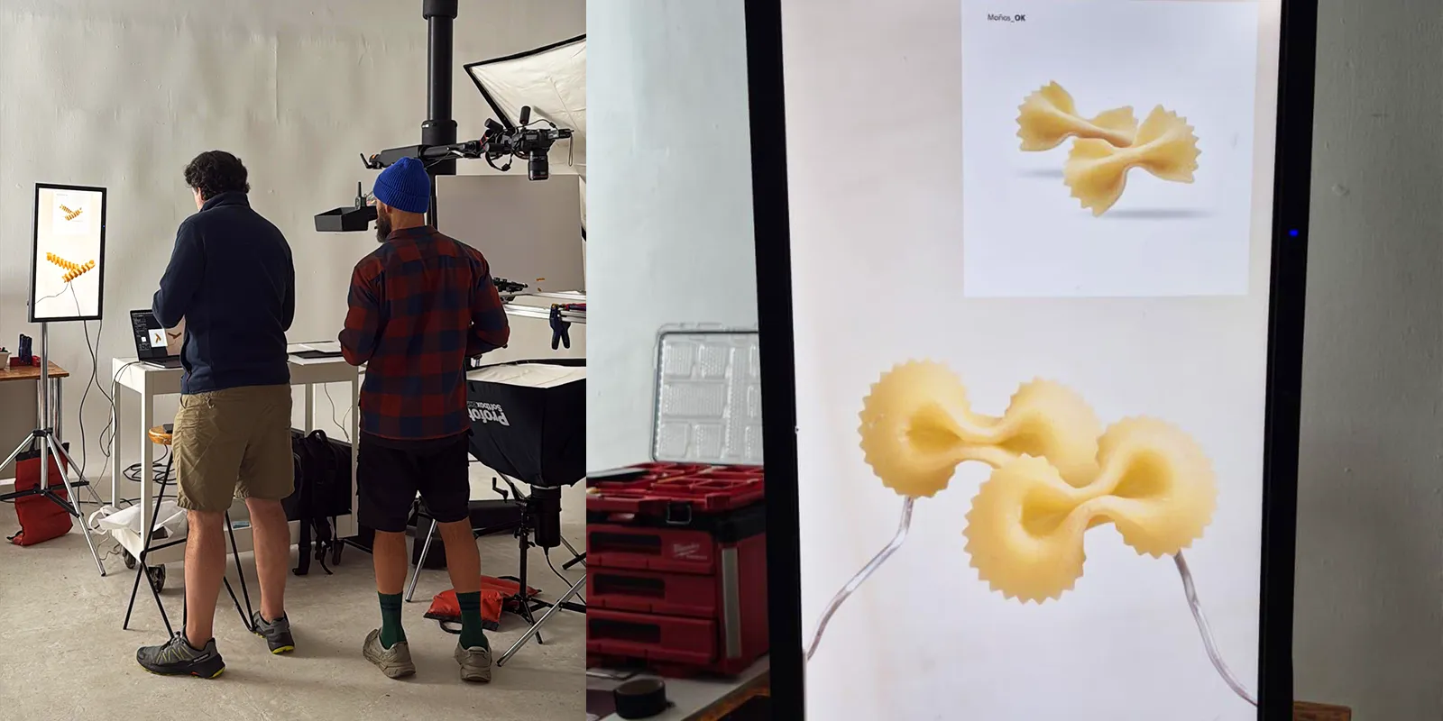
Equipo de diseño de Tridimage trabajando en la dirección de arte y fotografía de producto.
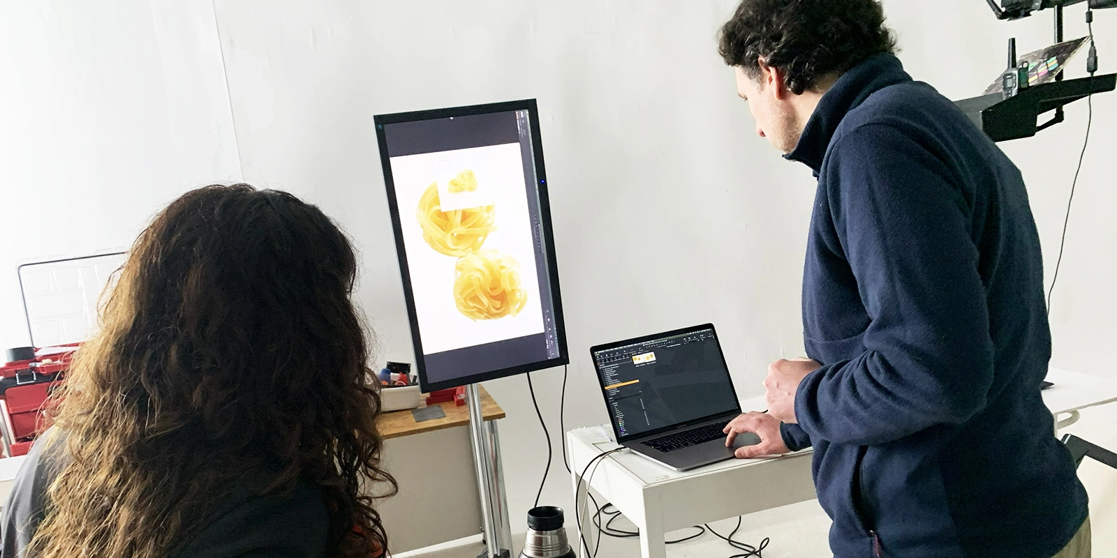
Diseñadores de Tridimage en sesión fotográfica y ajuste digital de imágenes de pasta.
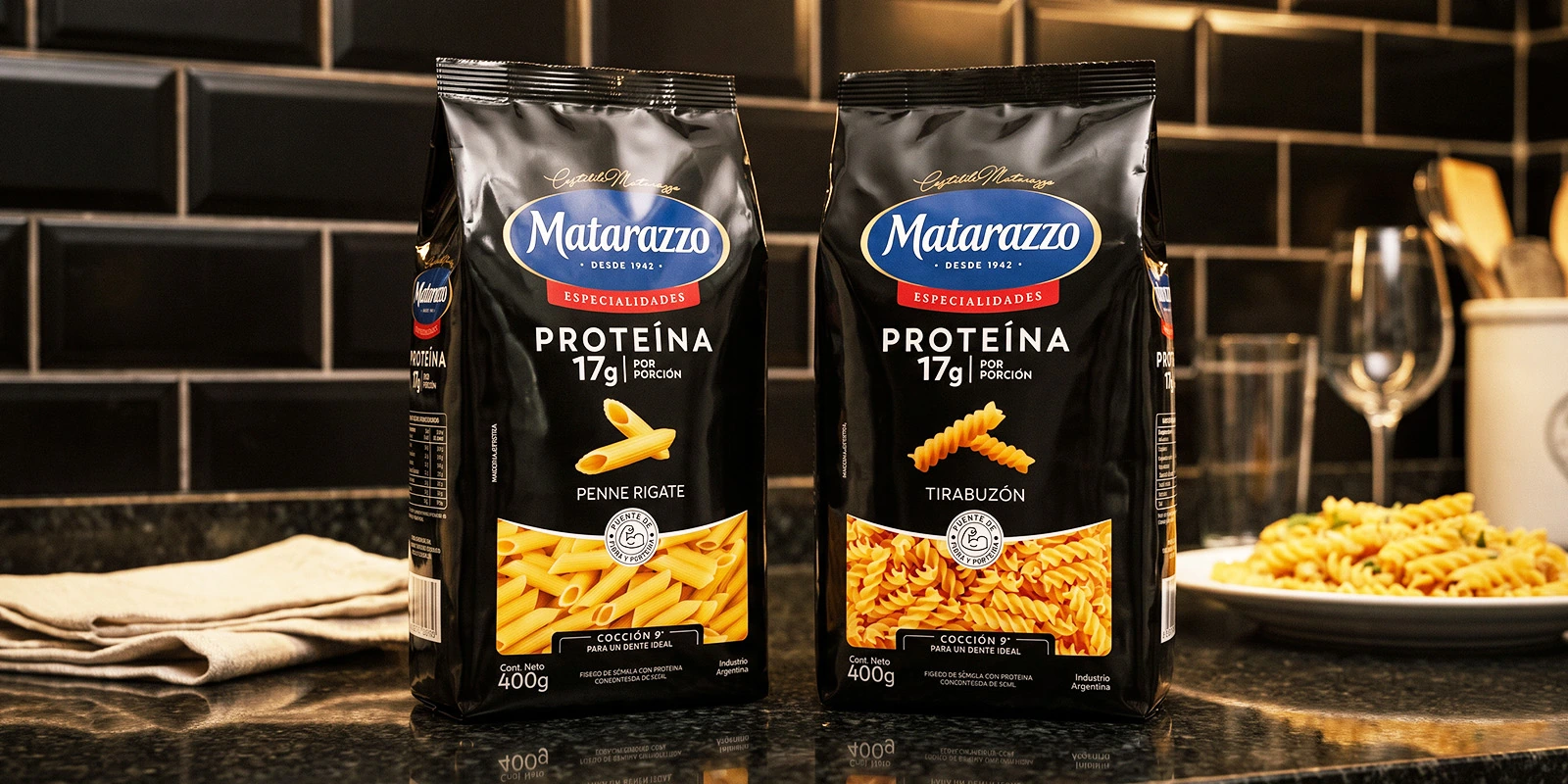
Packaging de fideos Matarazzo Especialidades Proteína en estantes oscuros de cocina moderna.
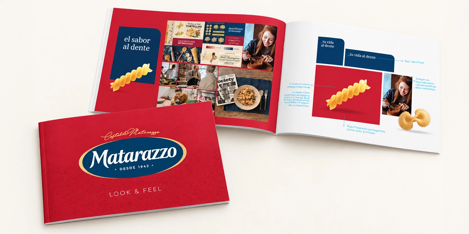
Brand book de Tridimage mostrando el nuevo look and feel y diseño de marca de Matarazzo.
Góndola de supermercado con los distintos tipos de pasta y packaging rediseñados de Matarazzo.

3. The Results

A Clearer Shelf and a Brand That Conveys Expertise

The line is in the middle of its launch and the full rollout on shelves is still pending, but the redesign is already giving its first signals. The brand perceives that, in an aisle full of stimuli and brands, Matarazzo looks like a clean space. With a more open design, the characteristic red and the clearly visible pasta are enough to convey the brand's quality. And the color coding of the specialties helps consumers recognize them better.

Touching Matarazzo is very relevant for Molinos, with many approvals and many eyes on it. Tridimage knows our culture and those back-and-forths, so we work around the same table, co-creating as a team. Very few agencies could have accompanied a process of almost two years this way, and having worked together for so long makes everything more agile. They understand the brand's rationale. They know which attribute we want to reinforce, which credentials we want to earn, and where we don't want to weaken. Every proposal comes with its reasoning behind it. I would sum them up in three pillars: teamwork, quality, and professionalism.
Martina Colombo Mei

Martina Colombo Mei Pasta Brand Manager at Molinos Río de la Plata